
beUI
Free, open-source animated components for React and Next.js, built with Motion and Tailwind CSS and distributed through shadcn.
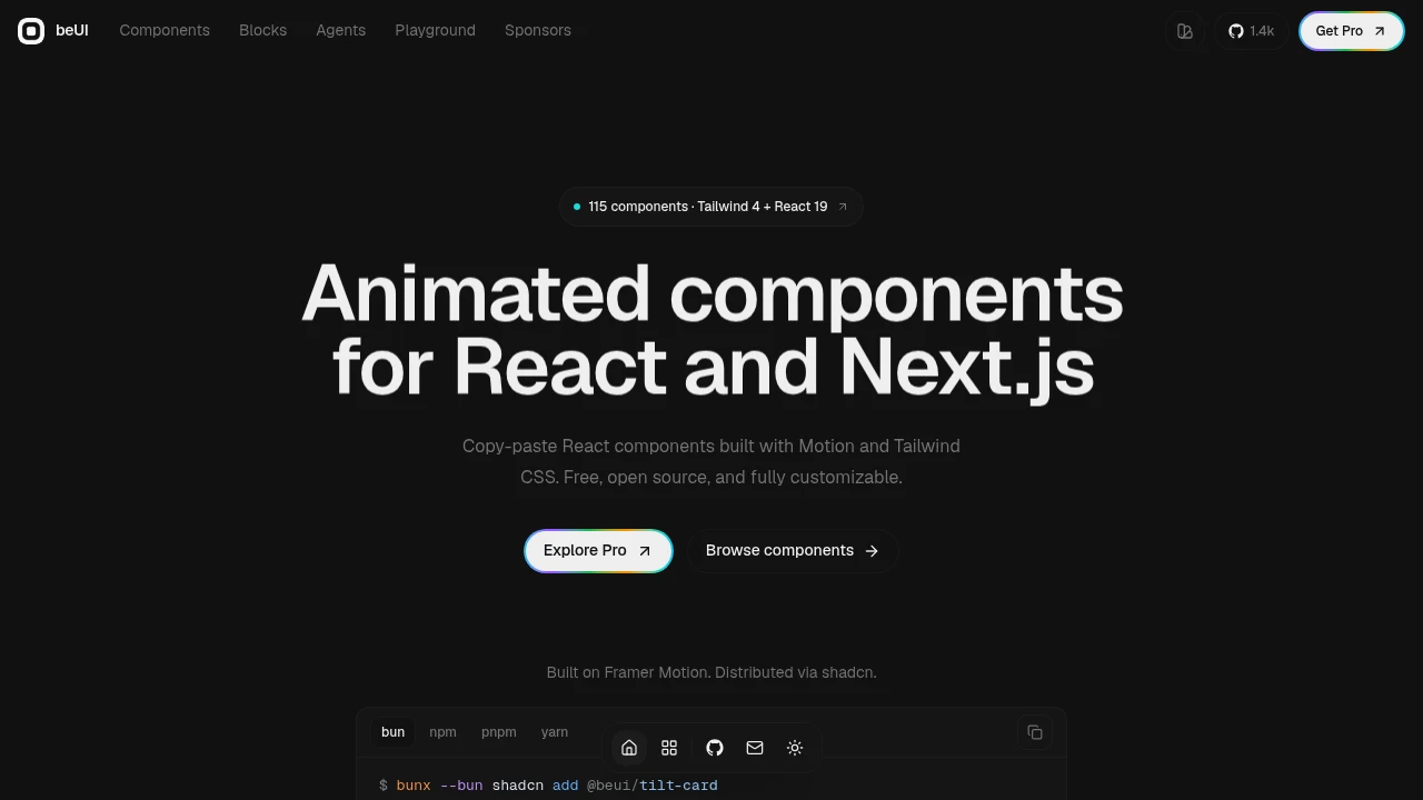
beUI is a free, open-source collection of copy-paste animated components for React and Next.js. Built with Motion and Tailwind CSS, it gives developers a way to add polished, motion-rich interactions without building every animation and interaction pattern from scratch.
The library covers common product UI alongside more specialized interaction patterns. Components can be installed through the shadcn CLI or registry, then customized directly in your application. Because the source code is the starting point, teams retain control over the implementation rather than depending on a closed component package.
Key Features
Copy-Paste Components
beUI follows a source-first workflow where component code can be dropped directly into your project.
- Copy and adapt source code
- Customize implementation directly
- React and Next.js focused
- Free and open source
- Designed for application UI
This makes the library suitable for teams that want ownership over how components behave and look inside their product.
shadcn Distribution
Install components through the shadcn CLI or registry and bring them into an existing React or Next.js project.
The distribution model provides a straightforward path from discovering a component to integrating and customizing its source.
Motion-Based Interactions
Components use Motion to provide richer interaction behavior and transitions.
Examples include:
- Spring movement
- Blur crossfades
- Layout-aware transitions
- Animated state changes
- Motion-rich UI interactions
The goal is to provide interaction polish without requiring developers to assemble each animation from scratch.
Tailwind CSS Styling
beUI uses Tailwind CSS for styling, making components easier to adapt to an existing design system.
Developers can customize the visual treatment directly alongside the component source rather than working around a separate styling abstraction.
Reduced-Motion Support
Accessibility considerations are included in components such as the accordion and slider through reduced-motion support.
This provides an alternative experience for users who prefer reduced animation.
Core UI Components
beUI includes motion-ready versions of common product interface patterns.
The collection includes:
- Buttons
- Tabs
- Drawers
- Toasts
- Tooltips
- Accordions
- Sliders
- Command palettes
- OTP inputs
- Theme toggles
- Bottom sheets
- Docks
- Swipeable lists
These components provide a foundation for adding consistent interaction patterns throughout a product.
Specialized Interaction Patterns
Beyond standard UI primitives, beUI includes more distinctive components for products that need standout interactions.
Examples include:
- Dynamic Island
- Morphing Modal
- Animated Toast Stack
- Card Folder
- Digit Swap
- Multi-chain Swap
- Bloom Menu
This mix lets developers either select a few memorable interactions or build a broader motion language across an application.
Built For React And Next.js
beUI is designed for developers and product teams building React and Next.js applications who want polished motion without creating every interaction from the ground up.
It fits products ranging from standard SaaS interfaces to applications where interaction design is an important part of the experience.
Common Use Cases
SaaS Interfaces
Add animated buttons, tabs, drawers, command palettes, notifications, and other common product interactions.
Navigation And Panels
Use drawers, bottom sheets, docks, accordions, and other animated navigation patterns.
Forms And Inputs
Add components such as OTP inputs and sliders with motion-aware interaction behavior.
Notifications
Use animated toast stacks for notifications, including stacked layouts, swipe dismissal, and actions.
Theme Switching
Use the Theme Toggle to create a more visual transition between themes through the View Transition API.
Standout Product Interactions
Add specialized components such as Dynamic Island, Card Folder, Digit Swap, or Bloom Menu when a product needs more distinctive interaction design.
Interaction Details
Some components focus specifically on maintaining a polished transition between interface states.
The Morphing Modal keeps a single panel while its inner views change, creating continuity between modal states.
The Animated Toast Stack manages stacked notifications with swipe dismissal and actions.
The Theme Toggle uses the View Transition API to transition the page with a full-screen reveal effect.
Why It Matters
Building a polished interface often means spending significant time recreating small interaction details: spring movement, transitions, notification behavior, modal state changes, and responsive feedback.
beUI provides these patterns as source-first, customizable components for React and Next.js. Developers can install them through the shadcn workflow, adapt the Tailwind styling, and control the final implementation directly in their own codebase.
Add Motion-Rich UI With beUI
Use copy-paste animated components to bring more polished interactions into React and Next.js applications. With Motion-based animations, Tailwind styling, shadcn distribution, reduced-motion support, and a mix of common and specialized components, beUI gives developers a flexible source-first foundation for building more engaging product interfaces.


