
What Is My Screen Size?
Instantly check your screen size, resolution, pixel density, aspect ratio, and display details with a free, private browser-based tool.
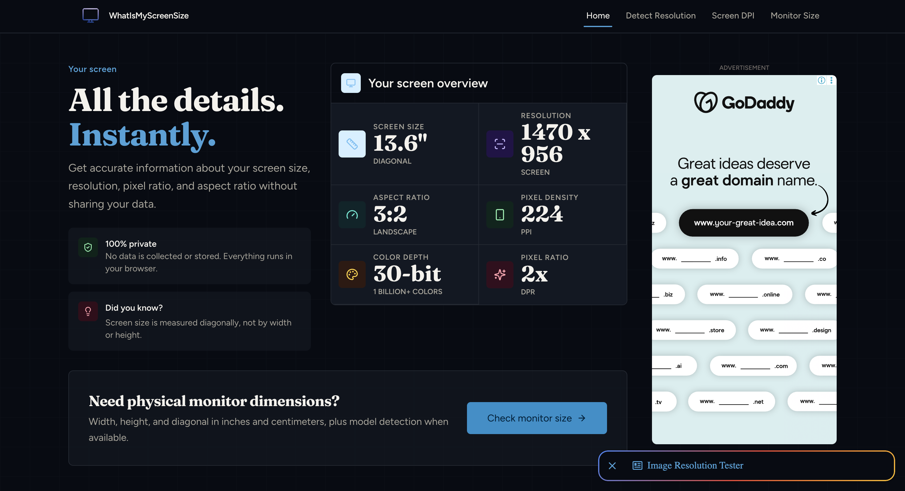
What Is My Screen Size? is a free browser-based toolkit for discovering detailed information about your screen and display. It instantly reports key display characteristics such as screen size, resolution, aspect ratio, orientation, pixel density, color depth, and device pixel ratio, giving developers, designers, and everyday users a quick way to understand their current display setup.
Beyond basic screen detection, the site includes dedicated tools for checking physical monitor dimensions, viewport size, screen resolution, PPI, monitor scaling, viewing distance, aspect ratios, CSS viewport units, and responsive breakpoints. Everything runs directly in the browser, with no data collected or stored.
Key Features
Instant Screen Information
Get detailed display information as soon as you open the tool.
It can show:
- Screen size
- Screen resolution
- Aspect ratio
- Orientation
- Pixel density
- Color depth
- Device pixel ratio
This makes it useful when you need to identify your current display configuration without installing software.
Physical Monitor Dimensions
Check the physical dimensions of your monitor to better understand the relationship between screen size and resolution.
This can be useful when comparing displays or working with layouts that need to account for physical screen characteristics.
Viewport Size
Measure the browser viewport separately from the physical display.
This distinction is particularly useful for web developers testing how a website or application behaves within the actual browser window.
PPI Calculator
Check pixel density and PPI to understand how densely pixels are packed on a display.
This provides additional context when comparing monitors and screens with different physical sizes and resolutions.
Monitor Scaling
Check display scaling information to understand how the operating system and browser may affect the effective size of interface elements.
This is useful when troubleshooting differences between physical resolution and the size available to websites or applications.
Viewing Distance
Use the viewing-distance tool when evaluating a screen setup and how far the display is positioned from the viewer.
Aspect Ratio Tools
Check and work with different screen aspect ratios when comparing displays or planning visual content.
CSS Viewport Units
Explore CSS viewport units for responsive web development.
This helps developers understand viewport-based sizing when creating layouts that need to adapt to different screen dimensions.
Responsive Breakpoints
Use breakpoint tools when planning responsive layouts and checking how interfaces should adapt across different viewport sizes.
Built For Developers, Designers, and Everyday Users
The toolkit is useful whenever you need accurate information about a screen or browser viewport without installing a dedicated application.
It is particularly useful for:
- Web developers testing responsive layouts
- UI designers checking screen and viewport characteristics
- Frontend teams working with CSS viewport units and breakpoints
- Developers troubleshooting display-related behavior
- Users identifying their monitor and screen specifications
Common Use Cases
Responsive Web Design
Check viewport dimensions, CSS units, and responsive breakpoints when building websites that need to work across different screens.
Display Comparison
Compare screen size, resolution, PPI, and aspect ratio when evaluating different monitors or display configurations.
Browser Testing
Understand the difference between your physical screen and the viewport available to a browser.
UI Troubleshooting
Check device pixel ratio, scaling, resolution, and viewport information when investigating why an interface appears differently across devices.
Screen Setup Planning
Use physical dimensions, PPI, and viewing distance information when evaluating a monitor setup.
Browser-Based and Private
The entire toolkit runs in the browser, so there is no software installation required.
The site also states that no data is collected or stored, keeping the screen information and calculations within a straightforward browser-based workflow.
One Toolkit for Screen and Display Information
Instead of using separate tools for resolution, PPI, viewport dimensions, scaling, aspect ratios, and responsive breakpoints, What Is My Screen Size? brings these utilities together in one place.
Check Your Screen Information Instantly
Discover your screen size, resolution, pixel density, viewport, scaling, and responsive display characteristics directly in your browser with What Is My Screen Size?


