
useLayouts
Free animated React components and micro-interactions built with Framer Motion and Tailwind CSS for production websites.
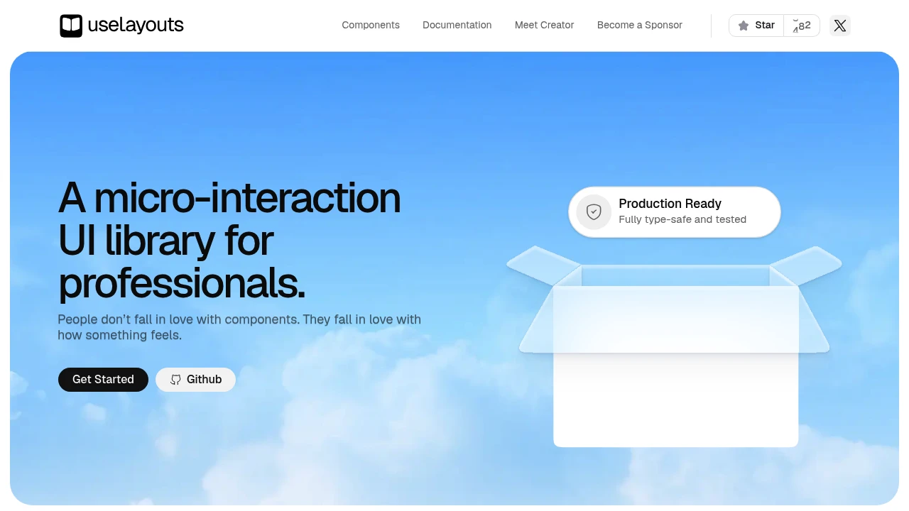
This micro-interaction UI library is built for React developers and teams who want polished motion without creating every animation effect from scratch. Designed around Shadcn UI, it provides ready-to-use animated components for forms, layouts, product interfaces and other interaction-heavy moments.
The library focuses on practical interface motion rather than decoration. Components are built with Framer Motion and Tailwind CSS and are described as production ready, fully type-safe and tested. The copy-and-paste approach makes it easy to bring individual interaction patterns into an existing codebase and customize them using familiar React, TypeScript and Tailwind workflows.
Key Features
Shadcn UI Foundation
Extend an existing Shadcn UI setup with components designed specifically around motion and interaction.
- Built for React projects using Shadcn UI
- Adds animation-focused components to existing interfaces
- Fits product pages, forms and application flows
- Keeps interaction patterns close to familiar UI conventions
Framer Motion Powered
The components use Framer Motion to provide smooth transitions and interactive effects.
- Motion-based UI components
- Smooth transitions and interaction states
- Familiar animation foundation for React developers
- Suitable for hover, movement and flow-based interactions
Copy-and-Paste Components
Add individual components directly to a project rather than adopting a large UI framework.
- Copy components into your codebase
- Choose only the interaction patterns you need
- Customize components after adding them
- Avoid unnecessary setup overhead
TypeScript Support
The library is designed with TypeScript in mind, with type inference built into the components.
- Fully type-safe components
- Built-in type inference
- Fits TypeScript-based React projects
- Easier integration with existing typed codebases
Tailwind CSS and CSS Variables
Use familiar styling tools to adapt the components to an existing product design.
- Tailwind CSS styling
- CSS variable support
- Adjust colors without heavy rework
- Customize animation timing and visual details
- Adapt components to existing design systems
Production-Ready Components
The components are described as production ready and tested, making them suitable for real product interfaces rather than only prototypes or demonstrations.
The library is intended for teams that need interaction quality alongside maintainable implementation, particularly when animations need to work reliably within forms, layouts and conversion-focused user flows.
Performance-Minded Motion
The library emphasizes lightweight animations designed for smooth interaction.
- Lightweight component approach
- Motion tuned for 60FPS animations
- Practical effects rather than unnecessary visual decoration
- Designed with everyday interface performance in mind
Built For React Product Interfaces
This library is aimed at developers and teams who already work with React, Shadcn UI, Tailwind CSS and TypeScript and want to introduce more polished interaction patterns into their products.
It is particularly useful when the interface needs to feel responsive and refined without requiring developers to build each animation from the ground up.
Common Use Cases
Signup and onboarding flows: Add motion to forms and interaction states to make multi-step or conversion-focused experiences feel more polished.
Product pages: Use animated components to create more engaging interactions around important interface elements.
Forms: Add feedback and movement to form interactions without implementing every animation manually.
Application layouts: Introduce practical motion into navigation, layouts and interface transitions.
Conversion-focused screens: Improve the interaction quality of landing pages, signup flows and other screens where the feel of the interface matters.
Shadcn-based products: Extend an existing Shadcn UI codebase with motion-focused components rather than replacing the underlying UI approach.
Design system customization: Use Tailwind CSS and CSS variables to adapt component colors, timing and other visual details to an existing product.
Why It Matters
Good interface motion is often the difference between a functional UI and one that feels polished. But building every hover effect, transition and interaction animation from scratch can add unnecessary development work.
This library provides a practical middle ground: production-ready animated React components that can be copied into a project, customized with familiar tools and adapted to existing Shadcn UI setups. Its emphasis on type safety, testing and performance makes it suited to teams that want micro-interactions to improve the product experience without becoming a separate engineering project.
Add Motion to Your React Interface
Bring polished micro-interactions into React projects with ready-to-use Shadcn UI components powered by Framer Motion and Tailwind CSS. Copy the patterns you need, customize them to match your interface and add more responsive interaction without building every effect from scratch.


